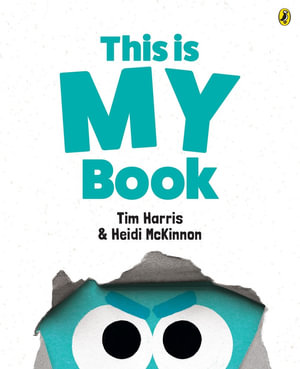
This is MY book by Tim Harris & Heidi McKinnon

The eyes on the front cover tell it all. They are glaring, daring eyes, and along with the title, This is MY book readers will know that they are in for a treat, exploring the selfish person who says such a thing. And the bold colours of the endpapers, signals the colours that are used through the book.
There is a continuous debate between the recto (left hand page) and verso (right hand page) and the looks as denoted by the shapes of the mouths, the eyebrows, the frown on the forehead and the looks in the eyes are startling giveaways to what each is thinking.
The story begins with recto welcoming us to his book. Verso disagrees saying the he may open the book but it is his page that begins the story. Isn’t ‘Once upon a time’, always on the right?'
Recto then says that he can prove the recto page is the best. And recto asks the illustrator to draw something that will impose a weight upon verso. The weight drags verso down which recto says proves that he is at the top, while the other is the bottom of the page. Not to be outdone verso calls upon the author to script a page for recto that puts him in his place. And what Tim Harris does causes a reversal of the position from the page before.
But recto says he has access to the paper supplies and blocks verso out from the page. But verso comes back with white ink.
On it goes making a point and then a counterpoint, the expression on the faces matching their determination and frustration. Just hilarious as the search goes on about which page is the best.
I can imagine kids acting out this book, using their faces to express themselves clearly to all concerned.
A wonderful treatise on ownership, as the two argue over who has the rights to the book, and argument as the debate continues, each finding a different point to pursue which furthers their own case.
Themes: Ownership, Debate, Argument, Word play, Humour.
Fran Knight